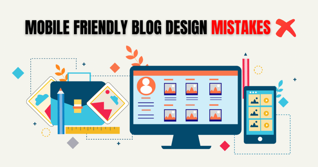
आज के समय में blogging सिर्फ desktop users तक सीमित नहीं है। लगभग 70% internet traffic mobile devices से आता है। इसलिए आपका blog mobile friendly होना बेहद जरूरी है। अगर आपका blog mobile devices पर सही से load नहीं होता, fonts readable नहीं हैं, images optimized नहीं हैं, navigation और ads confusing हैं तो visitors जल्दी exit कर देंगे।
Google ने भी 2018 से Mobile First Indexing लागू कर दिया है, यानी search ranking के लिए अब Google mobile version को primary मानता है। इस guide में हम detail में जानेंगे कि mobile friendly blog design mistakes कौन-कौन सी होती हैं, इनका SEO और user experience पर क्या असर पड़ता है और इन्हें कैसे avoid किया जाए।
📱 Mobile Friendly Blog Design क्या है?
Mobile friendly blog design का simple मतलब है कि आपका blog हर तरह की screen पर सही तरीके से open हो और पढ़ने में आसान लगे। Responsive design वाली themes automatically layout adjust करती हैं, जबकि non-responsive designs में users को zoom in/out करना पड़ता है और content पढ़ना मुश्किल हो जाता है।
Mobile friendly design के फायदे:
- Users को seamless experience मिलता है
- Google search rankings improve होती हैं
- Bounce rate कम होता है
- Conversion rates बढ़ते हैं
🗺 History & Importance of Mobile Friendly Blogs
Mobile devices की growth पिछले 5–6 साल में explosive रही है। India में लगभग 70% users सिर्फ mobile से internet use करते हैं। Google ने mobile friendly blogs को ranking में priority दी है।
Case Study: एक Indian personal finance blog ने देखा कि mobile optimized theme adopt करने के बाद उनके bounce rate 35% से घटकर 20% हो गया और average time on site 2 minutes से बढ़कर 4 मिनट हो गया।
Common Mobile Friendly Blog Design Mistakes
1. Non-Responsive Theme का Use करना
बहुत से bloggers free या outdated themes use करते हैं जो responsive नहीं होतीं। इससे mobile पर layout खराब दिखता है।
Why Wrong:
- Text और images overlap हो जाते हैं
- Users को zoom करना पड़ता है
- Bounce rate बढ़ता है
Example: Desktop पर perfect दिखने वाली theme mobile पर content cut करके दिखती है।
Solution:
- Lightweight और responsive theme चुनें (GeneratePress, Astra, Kadence)
- Mobile friendly test करें Google Mobile-Friendly Tool से
Pro Tip: Theme customize करते समय live preview हमेशा mobile view में देखें।
2. Font Size और Spacing का गलत होना
Mobile screen छोटी होती है। Small fonts और crowded spacing readability खराब कर देते हैं।
Why Wrong:
- Users जल्दी exit कर देते हैं
- Google metrics में bounce rate high होता है
Example: 10px font size वाली blog post mobile पर pin जैसी दिखती है।
Solution:
- Font minimum 16px रखें
- Line spacing 1.5x रखें
- Sans-serif fonts जैसे Roboto, Lato use करें
Pro Tip: Paragraphs को 4–5 sentences में divide करें, headings clear रखें।
3. Heavy Images और Slow Loading Speed
Large images page loading slow कर देती हैं। Mobile data connections desktop जितने fast नहीं होते।
Why Wrong:
- Users impatient होकर exit कर जाते हैं
- Google ranking drop होती है
Example: DSLR से ली गई 5MB images post में डाल दी गईं → Page load 12 seconds में हुई
Solution:
- Images compress करें (TinyPNG, ShortPixel)
- WebP format use करें
Pro Tip: Lazy loading enable करें ताकि above-the-fold content जल्दी load हो
4. Pop-Ups और Ads का गलत Placement
Mobile screen छोटी होती है। Wrong placement irritate करता है।
Why Wrong:
- Users तुरंत exit कर देते हैं
- Accidental clicks → Adsense violations
Example: Recipe blog पर page open होते ही 3 pop-ups दिखाए गए → User exited immediately 😕
Solution:
- Pop-ups dismissible रखें
- Auto pop-ups limit करें
- Mobile ads carefully place करें
5. Complicated Navigation Menus
Mobile users simple navigation चाहते हैं। Complex menus confuse करते हैं।
Why Wrong:
- Users content तक नहीं पहुँच पाते
- Bounce rate बढ़ता है
Example: Tech blog में 15 categories menu में → Mobile पर 3 lines में split
Solution:
- Important categories रखें, subcategories dropdown में डालें
- Sticky menu add करें
6. CTA Buttons का Small या Wrong Placement
Call to Action buttons mobile-friendly नहीं → click नहीं हो पाते।
Why Wrong:
- Affiliate conversion drop
- Newsletter signups कम
Solution:
- Minimum size 44x44px
- Contrasting color
- Content के बीच और अंत में place करें
7. AMP Setup न करना (जहाँ जरूरी हो)
AMP pages fast loading experience देते हैं।
Why Wrong:
- News blogs top stories में entry miss कर देते हैं
- Speed और UX पर negative impact
Solution:
- News और content-heavy blogs में AMP enable करें
- Personal blogs optional
8. Unoptimized Plugins और Widgets
Plugins load time बढ़ाते हैं।
Why Wrong:
- Slow mobile experience
- Google PageSpeed Insights score कम
Solution:
- सिर्फ जरूरी plugins use करें
- Extra widgets हटाएँ
- Cache plugin use करें
SEO & User Experience Impact
- Bounce rate बढ़ना
- Mobile search ranking में drop
- Conversion और affiliate revenue पर negative effect
- Brand trust कम होना
Mobile Friendly Blog Design Best Practices
- Lightweight responsive theme choose करें
- Readable fonts और spacing
- Compressed images (WebP preferred)
- Simple navigation
- Limited pop-ups
- Optimized CTA buttons
- AMP setup जहाँ जरूरी
- Minimum plugins + caching
Pro Tips & Case Studies
- ShoutMeLoud: mobile optimization से bounce rate 30% improve
- Neil Patel: optimized images + caching → average time on site 40% बढ़ा
- Hindime.net: lightweight theme + responsive design → Google Discover ranking improve
FAQs
A: लगभग 70% traffic mobile से आता है। Google mobile-first indexing follow करता है।
A: Google अब desktop version की बजाय mobile version को primary मानता है।
A: GeneratePress, Astra, Kadence, Blocksy
A: PageSpeed Insights, GTMetrix, Pingdom
A: News blogs में जरूरी, personal blogs में optional
Conclusion + Actionable Tips
Mobile friendly blog design अब choice नहीं, necessity है। Responsive theme, readable fonts, compressed images, simple navigation, proper CTA buttons और optimized plugins use करें।
Checklist:
- Mobile friendly test ✅
- Page load <3 seconds ✅
- Fonts readable, buttons clickable ✅
- Pop-ups limited ✅
इन सभी measures से आपका blog Google Discover, Google News और SERP में rank कर सकता है और visitors happy रहेंगे। 😀😀
“मैं Aashish Singh, एक passionate content creator और digital entrepreneur हूँ। मुझे Blogging, SEO और Affiliate Marketing का real-time अनुभव है और मैं अपने ब्लॉग पर step-by-step tutorials, case studies और earning tips share करता हूँ। मेरा mission है कि हर beginner blogger online दुनिया में अपना career बना सके।”
Discover more from Akblogger
Subscribe to get the latest posts sent to your email.