आज के digital world में internet users का लगभग 80% traffic mobile devices से आता है। ऐसे में अगर आपकी website mobile पर सही से load नहीं होती, तो users वापस चले जाते हैं — और यही आपकी ranking को नुकसान पहुंचाता है।
Mobile Optimization का मतलब होता है अपनी website को इस तरह design और optimize करना कि वो mobile devices (smartphones, tablets) पर fast, readable और user-friendly लगे।
- Simple शब्दों में कहें — “Mobile Optimization ensures कि आपकी website हर screen size पर best experience दे।”
📌 Example के लिए मान लीजिए आप किसी blog पर जाते हैं और text बहुत छोटा दिखता है, buttons click नहीं होते या images बाहर निकल रही हैं — तो वो mobile optimized नहीं है।
Google अब ऐसे websites को down-rank कर देता है क्योंकि उसके लिए User Experience (UX) सबसे बड़ा ranking factor है।
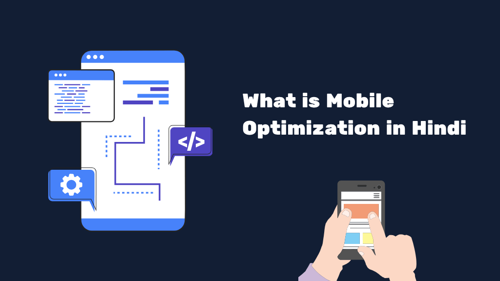
Mobile Optimization की Definition
Mobile Optimization एक ऐसी SEO technique है जिसमें website की design, structure, speed और usability को इस तरह adjust किया जाता है कि वो हर type के smartphone या tablet पर perfectly show हो।
इसका मुख्य उद्देश्य है:
- Users को fast loading experience देना ✅
- Content को readable और scroll-friendly बनाना ✅
- और सबसे जरूरी — Bounce Rate को कम करना ✅
👉 In short, mobile optimization = “User comfort + SEO performance.”
Mobile Optimization का इतिहास (History of Mobile Optimization in Hindi)
अगर हम पिछले दशक पर नजर डालें, तो 2000s में websites केवल desktop के लिए बनाई जाती थीं।
लेकिन 2010 के बाद smartphones के बढ़ते use ने web world को बदल दिया।
2015 में Google ने ‘Mobilegeddon Update’ launch किया — इस update ने साफ कर दिया कि जो websites mobile friendly नहीं होंगी, उन्हें search result में नीचे किया जाएगा।
इसके बाद 2018 में आया Mobile-First Indexing Update, जिसमें Google ने यह rule बना दिया कि indexing अब mobile version के आधार पर होगी, न कि desktop version पर।
इसका मतलब —
👉 अगर आपकी mobile site slow या unoptimized है, तो आपकी SEO ranking automatically नीचे जाएगी।
Mobile Optimization कैसे काम करता है (How Mobile Optimization Works)
Mobile Optimization में कई elements काम करते हैं। यह केवल design का issue नहीं है, बल्कि technical SEO का एक बड़ा हिस्सा भी है।
नीचे दिए गए steps बताते हैं कि ये process कैसे काम करता है:
- 🎭 Responsive Design:
Website का layout automatically हर screen size के हिसाब से adjust हो जाता है। - 🖼 Image Compression:
Large size images को compress किया जाता है ताकि site speed बढ़े। - ⚡ AMP (Accelerated Mobile Pages):
AMP pages fast load होते हैं और Google Discover में ज़्यादा prefer किए जाते हैं। - 📱 Mobile-friendly Navigation:
Menus, buttons, और links thumb-friendly बनते हैं ताकि user easily navigate कर सके। - ✏ Readable Fonts & Spacing:
Proper font size और spacing readability को बढ़ाते हैं। - 🔧 Testing Tools:
Google Mobile-Friendly Test tool से check किया जाता है कि site mobile optimized है या नहीं।
Mobile Optimization क्यों जरूरी है?
आज के समय में, अगर आपकी website mobile optimized नहीं है, तो आप लगभग 70% traffic खो देते हैं।
कुछ मुख्य कारण नीचे दिए गए हैं:
- Google Ranking: Mobile-friendly websites को search results में priority मिलती है।
- Better User Experience: Users को smooth browsing मिलती है, जिससे engagement बढ़ता है।
- Low Bounce Rate: Unoptimized websites पर users कुछ seconds में निकल जाते हैं।
- Higher Conversions: Mobile users fast decision लेते हैं — especially eCommerce websites में।
👉 उदाहरण के तौर पर, Flipkart और Amazon जैसी companies ने अपनी websites को mobile-first approach से design किया है ताकि हर device पर वो perfect दिखें।
Mobile Optimization Techniques & Best Practices
- Use Responsive Themes: WordPress या Blogger में ऐसे themes use करें जो 100% responsive हों।
- Optimize Images: TinyPNG या ShortPixel जैसे tools से images compress करें।
- Avoid Pop-Ups: Mobile screens पर pop-ups irritate करते हैं और UX खराब करते हैं।
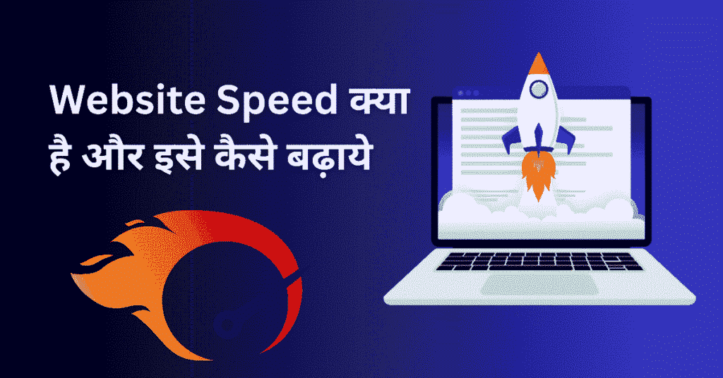
- Improve Page Speed: Cache plugin, CDN (Cloudflare), और lazy loading use करें।
- Use AMP Pages: News & Blogs के लिए AMP format बहुत effective है।
- Font & Button Size: Minimum 16px font और 48px button spacing रखें।
Mobile Optimization Tools (Best Tools for Testing & Improving)
| Tool Name | Purpose |
|---|---|
| Google Mobile-Friendly Test | Check करें आपकी site mobile friendly है या नहीं |
| PageSpeed Insights | Speed score और improvement suggestions |
| GTmetrix | Full performance analysis |
| Screaming Frog | Technical SEO + Mobile issues check |
| SEMrush Mobile Audit | Deep mobile optimization audit |
Web Crawling & Mobile Optimization का संबंध
Mobile Optimization और Web Crawling दोनों SEO के core factors हैं।
जब Googlebot किसी site को crawl करता है, तो अब वो Mobile-first Googlebot version से crawl करता है।
अगर आपका mobile version incomplete है, तो crawler आपकी site को partially index करेगा।
इसलिए हमेशा canonical URLs, structured data, और responsive design maintain करें ताकि Googlebot को clear signals मिलें।
Mobile Optimization के फायदे
- SEO ranking में सुधार
- Fast website loading
- Better user engagement
- Higher CTR (Click-Through Rate)
- Low bounce rate
- Better ad performance (especially Google Ads में)
Mobile Optimization के नुकसान (Minor Challenges)
- Development cost थोड़ा बढ़ सकता है
- Testing & debugging थोड़ा time-consuming होता है
- AMP pages customization limited होती है
लेकिन long-term में, इसके फायदे नुकसान से कहीं ज़्यादा हैं।
Pro Tips for Bloggers & Business Owners
- हमेशा responsive WordPress themes (GeneratePress, Astra, Kadence) का use करें।
- AMP plugin install करें अगर आपका focus News या Blog content पर है।
- Text spacing और line height maintain करें ताकि readability strong हो।
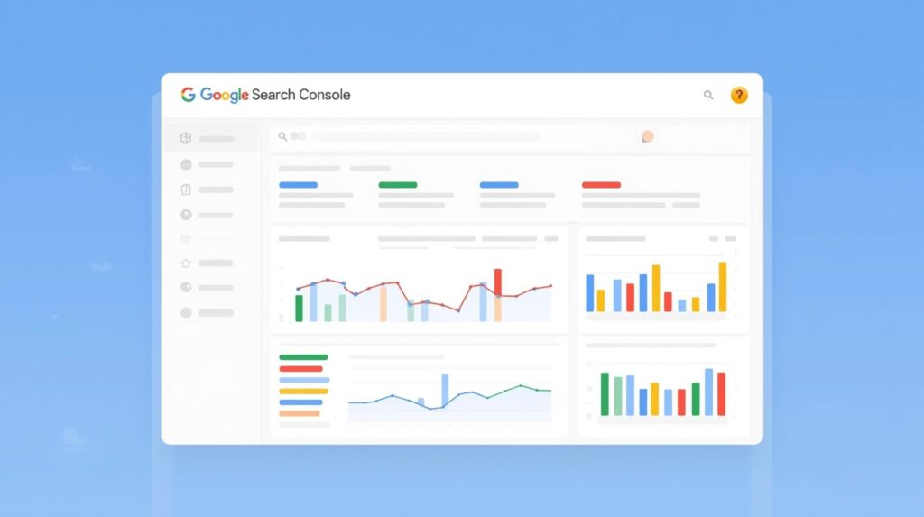
- Regularly Google Search Console में “Mobile Usability” section check करें।
FAQ’s – Mobile Optimization in Hindi
👉 यह एक SEO process है जिससे websites को mobile devices के लिए user-friendly और fast बनाया जाता है।
👉 हां, mobile-friendly website Google ranking में top पर आती है।
👉 AMP का मतलब है Accelerated Mobile Pages — यह pages को super fast load करने में मदद करता है।
👉 Google Mobile-Friendly Test में अपनी site का URL डालकर check कर सकते हैं।
👉 Partially हां, लेकिन speed, image compression, font size और usability भी optimize करनी पड़ती है।
Conclusion: Mobile Optimization Future SEO की नींव है
2025 और उसके बाद का समय Mobile-first Internet Era है।
अगर आपकी website mobile devices के लिए optimize नहीं है, तो आप traffic, revenue और ranking — तीनों खो सकते हैं।
Mobile Optimization सिर्फ एक SEO step नहीं बल्कि आपकी website की digital identity का foundation है।
इसलिए आज ही अपनी site को mobile friendly बनाइए और Google पर अपनी visibility बढ़ाइए 🚀
“मैं Aashish Singh, एक passionate content creator और digital entrepreneur हूँ। मुझे Blogging, SEO और Affiliate Marketing का real-time अनुभव है और मैं अपने ब्लॉग पर step-by-step tutorials, case studies और earning tips share करता हूँ। मेरा mission है कि हर beginner blogger online दुनिया में अपना career बना सके।”
Discover more from Akblogger
Subscribe to get the latest posts sent to your email.